

Email Design System
hipages
hipages
Hipages is a web and app platform that allows customers to find a tradesman to complete a job around their home. Customers are able to post their job through the app and provide a brief description about what they need done as well as upload images for the tradesman to see. Customers are then connected to local tradesman where they get quotes for their job and select a tradie to complete it.
The opportunity
What we were finding was that once a customer had posted a job they were getting sent a large volume of emails which was getting confusing and difficult to manage. Costumers were left confused about the process and what to expect next.
Help guide the customer through the process and set expectations.
Drive them into the app via emails so they could communicate quickly with tradies.
Increase engagement with new customers and the app.
Project Role
Product Designer

Mapping out the flow that the emails will be sent to the users.
The approach
The first thing we set out to do was come up with a set of design principles that all the emails we sent out would follow.
Each email we send must:
Be part of a coherent journey (explain the next steps)
Tell the relevant parts of the story so far (no need to refer to a previous email)
Be justifiable (offer real customer value)
Give a clear call to action (secondary messages should not compete
with the primary CTA)Be easy to understand (minimum number of words, no jargon)
The key metrics we were looking at for this to be a success were:
Increased engagement in email CTAs
More repeat jobs from new and existing consumers
The design
The current emails didn’t give the users confidence of where they were in their process of hiring a tradie. There was an inconsistent look and feel to the emails getting sent was giving the new users a poor experience to the brand. We wanted to start by changing this.
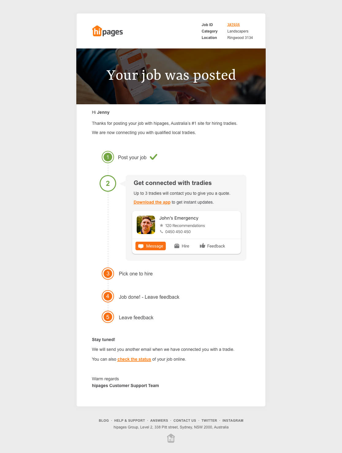
We looked at introducing a timeline and showing the user what step they were up to.

The outcome
The new email design saw an increase in the amount of jobs people were posting with the platform and an increase in messaging between the customer and the tradie with the new messaging layout. The simple task of redesigning an email system was much bigger than I thought and made me realise the importance of getting the microcopy just right. But the results of this project proved a success and I learnt a lot.
Results since release
+14% increase in feedback left for the tradies
+7% increase in messages sent
+49% increase in engagement sessions
+27% increase in jobs posted on hipages
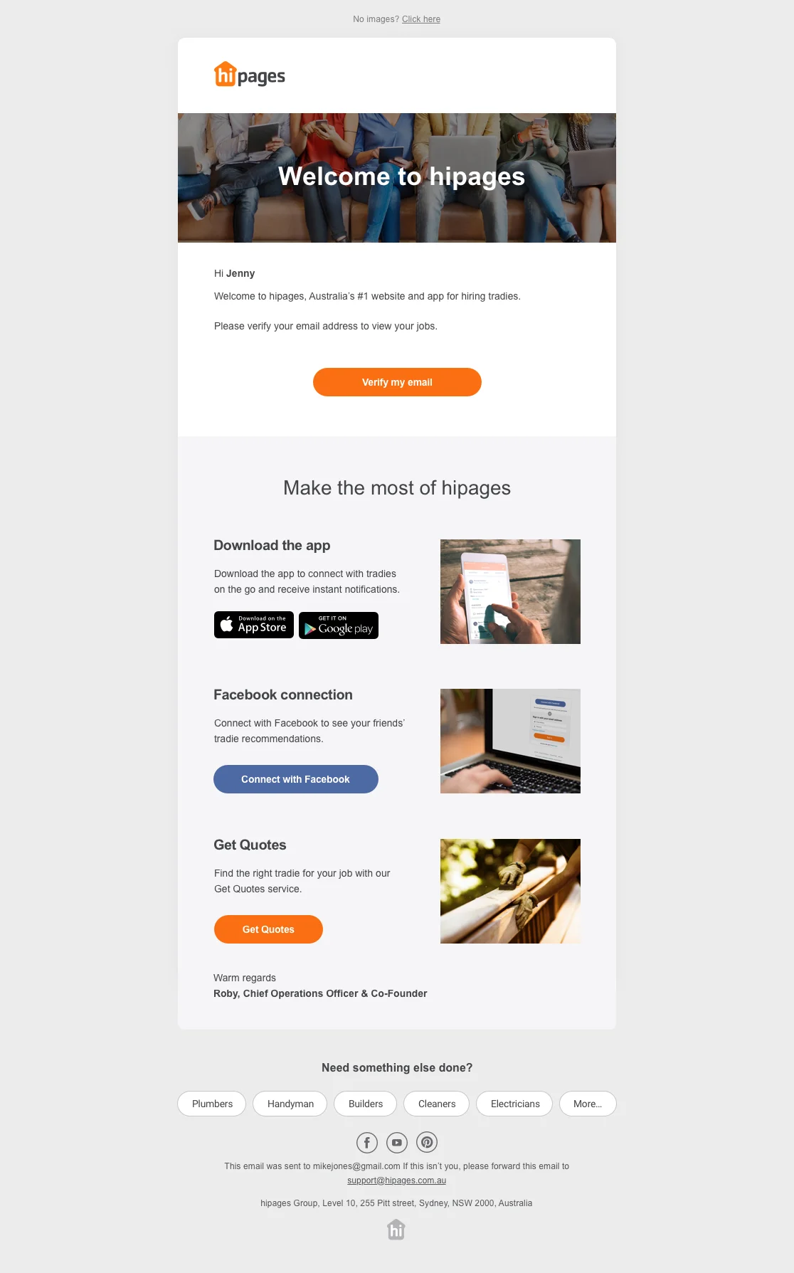
New Welcome design
The Welcome email was made to feel more friendly and presenting the user with some clear options on what to do next with our platform.

New Tradie connection design
The introduction of the timeline and the numbered steps were a success. Including ‘Quick replies’ in the top of the email helped the user know where to start a conversation with a connected tradie.
