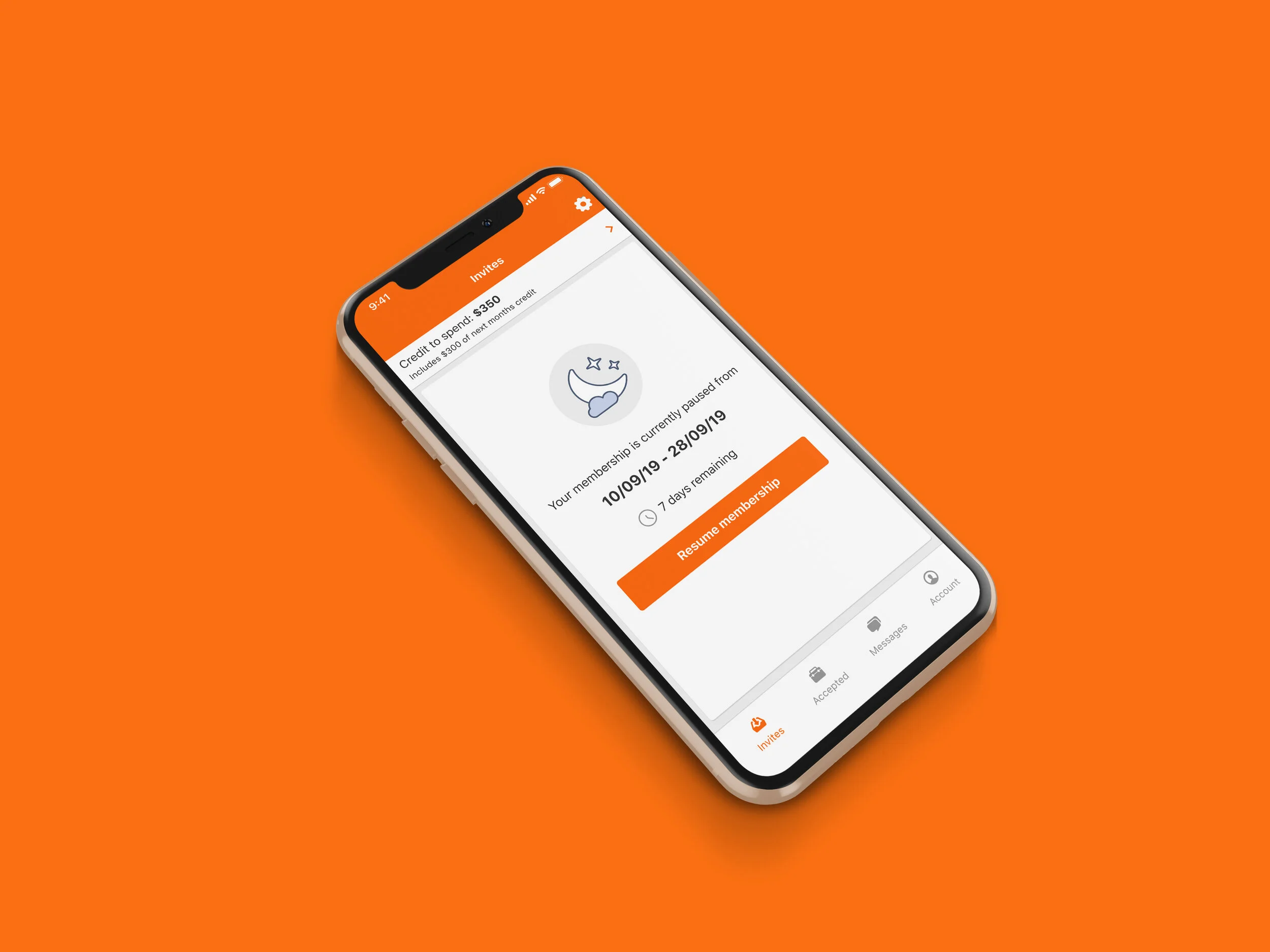
Hipages is a marketplace platform that connects customers to local tradespeople to complete jobs around the house. I was tasked with designing a feature that allowed tradespeople to request a pause of their memberships.
My role
Interaction design, Visual design, User flows, Rapid prototyping, User research and UI design.
Results
• Reduced time for service reps to process a pause request.
• Increased sales of premium subscriptions that included pausing memberships.
Lessons learned:
01
Billing and payment systems are a challenging constraint.
When a tradesperson paused their membership they also got a new billing date when their account was resumed. It was difficult to communicate this in the product and help the user understand why this happened, especially when customers set their recurring payments up on a specific date.
02
Talking early to the right teams paid off.
Sitting down and chatting with the sales and data teams provided great insights. They provided how long pause requests were so we knew the minimum and maximum length to set as a criteria.
Research
Starting at the beginning I set out to find how cumbersome the process was for sales reps to pause membership for customers.
I interviewed the service manager, who caught me up to speed with what happens today when a tradesperson requests a pause. Due to the current system not having a pause feature the hacky way sales reps paused membership was to deactivate them and then reactivate them when they wanted to resume services.
The user flow when a customer requests to pause their membership.
The next area I was diving into was looking into the reasons people were requesting to pause and for how long they intended to have their membership paused. Working with the data science team I was able to identify the average pause length being requested, this would help inform the design solution and develop business rules around eligibility for pausing a membership.
Pause length requests
Reasons for pausing memberships
Design
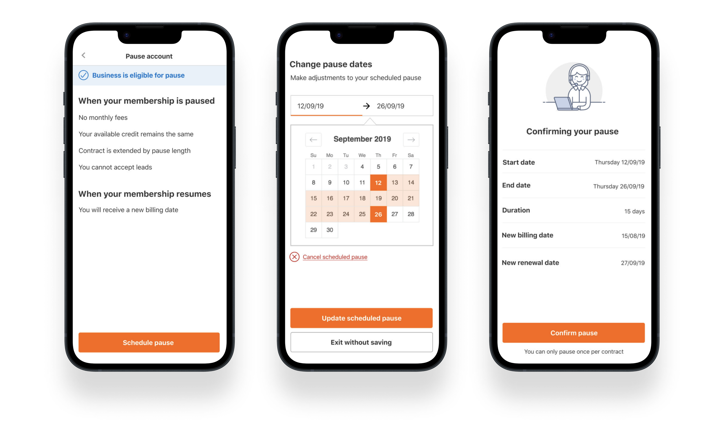
I wanted to ensure that pausing a membership was a familiar and seamless experience, so I looked to booking and reservation experiences for inspiration. The design had to communicate clearly what was happening before and after an account membership was paused.
Using all of my research to help craft the rules and eligibility for pausing a membership, my Product Manager and I came up with the following:
Pausing a membership can be up to 4 weeks.
It must be a minimum of 2 weeks (for billing purposes).
One pause per contract.
Leads will stop being sent to the tradesperson’s phone.
A new billing date will be issued when the membership is resumed.
Now that I had worked with the finance and engineering team to set up how pause would work for the business, I now had to consider the user experience for our customers. I researched how other companies have solved a similar problem and if there are any opportunities to incorporate findings into our service. Streaming services such as Netflix and YouTube were good examples of communicating transparency on how the pause process worked. Our goal was for the pause screen to clearly state what would happen if you paused and what would happen next, as they can pause once per contract.
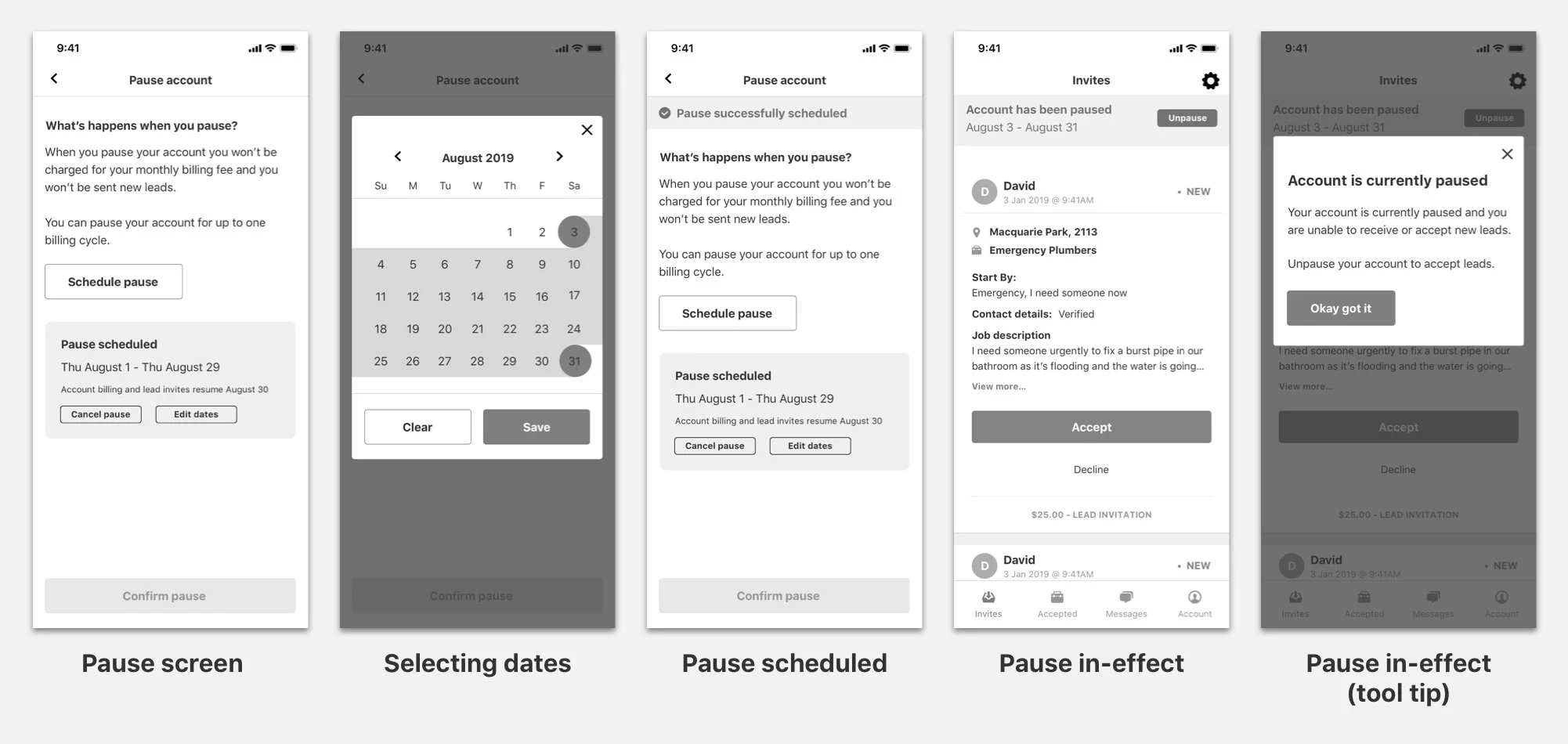
Below you can see some early designs trying to see which pattern would be most straightforward for a tradesperson. Unfortunately, tradespeople are often very busy and sometimes have dirty hands or are holding equipment that makes tapping the screen difficult; I had to ensure that the designs were easy to read and buttons were easily tappable.
Early explorations included clear CTA buttons and panels to highlight important information.
Testing
Once I had a prototype designed I scheduled some time with 10 tradespeople to test the usability and comprehension of pausing a membership. In addition to testing the design concepts, I was asking questions about the value of this feature and whether they would pay extra or upgrade to a premium package to have access to this.
For testing, there were three tasks I wanted our participants to complete; these tasks tested usability and comprehension. The scenario I gave them was, “Imagine you are looking to book a holiday with your family with these specific dates; where in the app would you look to pause your membership while on holiday?”.
The tasks were:
Locate the pause settings.
Schedule a pause during the given dates
Edit the pause dates
Unpausing your membership.
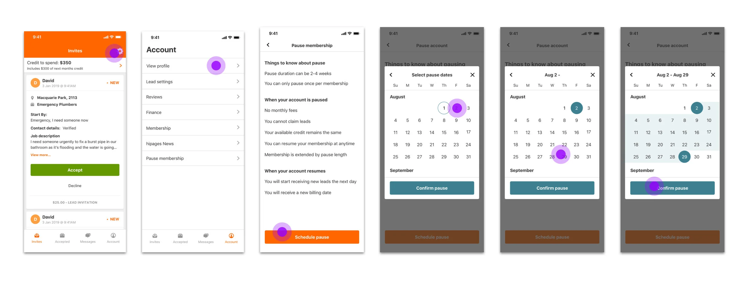
Task 1: Finding where pause is located in the app and selecting the dates of the pause period.
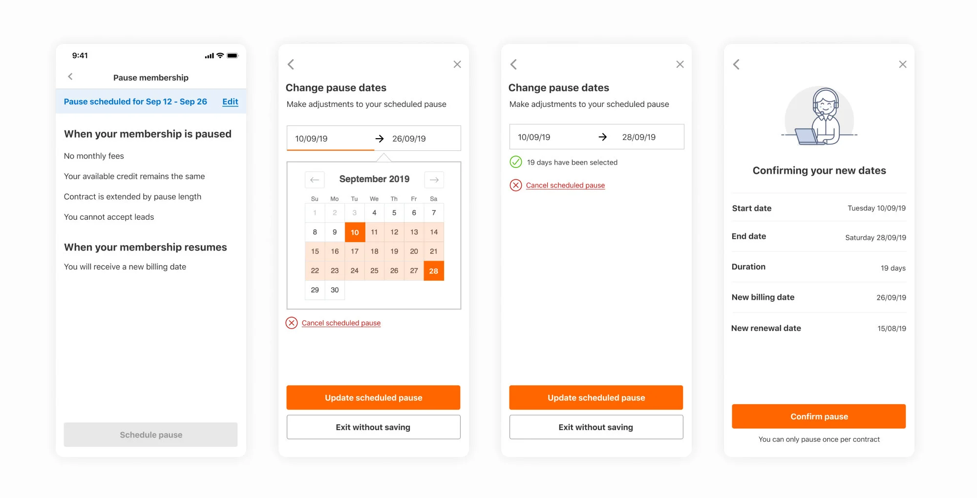
Further iteration of designs after usability testing.
Overall the testing was positive, and the tradespeople welcomed the feature. They passed most of the usability tests; they only got confused when they had to edit a pause. As for comprehension, that also tested well; tradespeople understood what would happen to their membership when they activated pause.
Insights:
The date picker pattern we used for the UI was easy to use.
Tradespeople knew they had to go back into the ‘Pause section’ to make any edits to dates.
Once in edit mode, they thought they had to tap ‘Delete scheduled pause’ to clear and re-edit the new dates.
Tradespeople quickly found the pausing feature within the ‘Account’ section in-app.
Membership extension was the only sentence they had to review to validate before scheduling a pause.
Tradespeople did find value in pausing their membership once a year as there was always a year that they would like to have off or stop receiving leads as they were fully booked. They saw this as a way to save money and not have their credit just sitting there doing nothing. This was especially encouraging for our sales team.
