
Personal project
Reading Cinemas
Reading Cinemas are a chain of cinemas showing movies across Australia. However, they are only a medium-sized business and need to catch up with some of their competitors regarding their digital presence. I recently bought some movie tickets through the Reading Cinemas website and found the checkout process very frustrating and outdated compared to today’s standards. So I decided to take it upon myself to develop a better user experience.
The opportunity
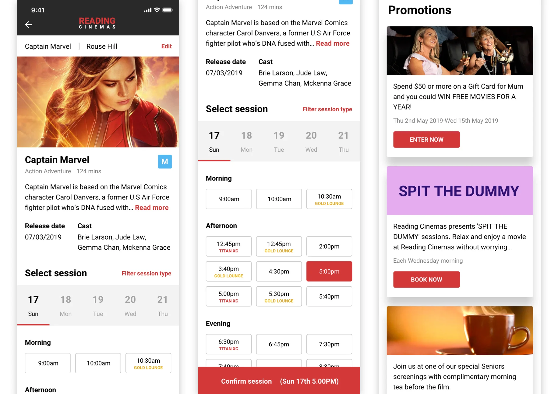
The current mobile experience for booking a movie ticket is prolonged. It does not show movie descriptions or allow users to browse what is playing or coming soon. Special promotions and offers are hidden almost entirely, so users can’t take advantage of this business feature.
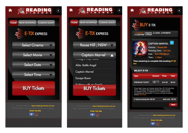
The current mobile experience for purchasing a movie ticket.
Assumptions
Displaying movies that are showing, as well as those that are coming soon, will create a better browsing experience.
Making the special offers and promotions more visible will incentivise users to purchase some of the ticket deals.
Spreading out the booking process for a ticket so that a user does not have to fill out multiple forms at once will reduce friction with the checkout process.
The design
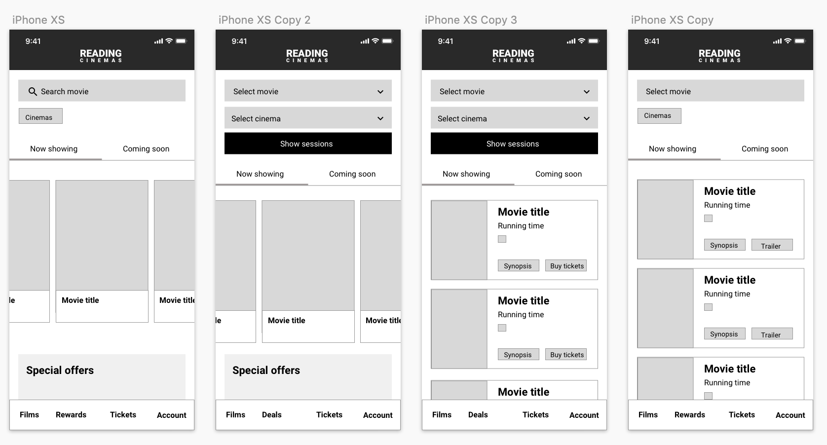
I wanted to put the movies at the forefront of the home screen and show people they can quickly swipe through what is available. Using the lovely imagery that movie posters provide and allowing the user to click on the movie card to get to the ticket process was vital. If the user wanted to search further or couldn’t find what they were looking for, I put a search bar up the top, which they could search by movie and cinema. Some users might not have a specific movie in mind and want to see what’s playing in their local theatre.
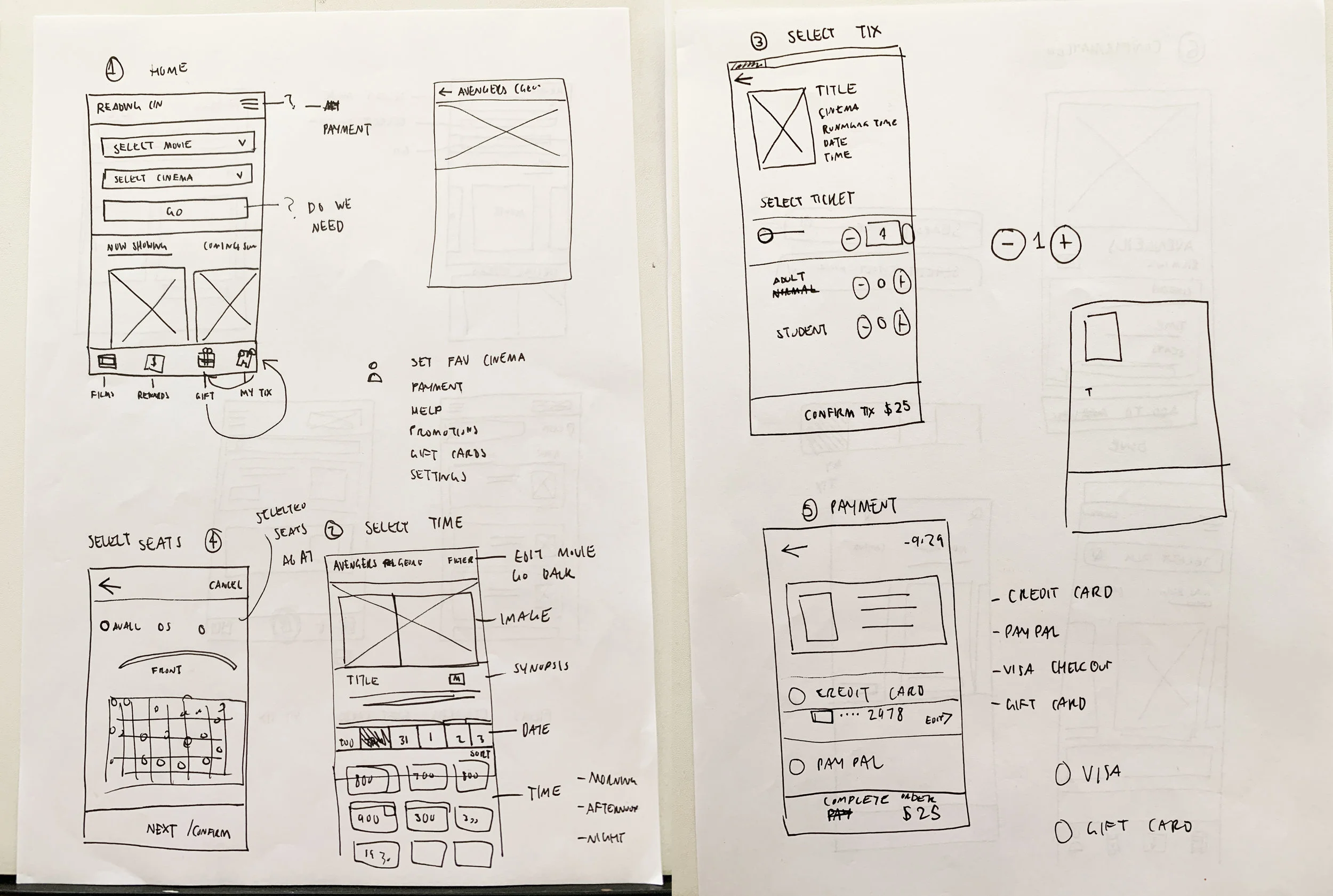
I sketched out many variations of the checkout flow, considering which steps can be combined and which should be left with their own screens.
Home screen exploration.
Coming up with the design aesthetic, I wanted the app to have a clean design with only a few colours appearing as calls to action. Taking the colour palette from the logo, I used dark charcoal for headings and red for buttons and tappable links. In addition, I wanted to make it clear to users what they could tap.
To make the offers and promotions a feature, I made that section part of the main navigation. In addition, the red notification marker will alert users that a new promotion is currently running. This should attract more views and increase ticket sales.
I kept a clean colour palette and made red the primary call to action colour.
The outcome
At the start of this project, it would be easy to improve upon the current design. But delving into buying a movie ticket and considering all the information that has to be presented in each step of the journey took a lot of work. As a result, I have come away with an easy-to-navigate design that guides the user through each step.
Taking an old and outdated experience and developing solutions to improve the experience was really fun!
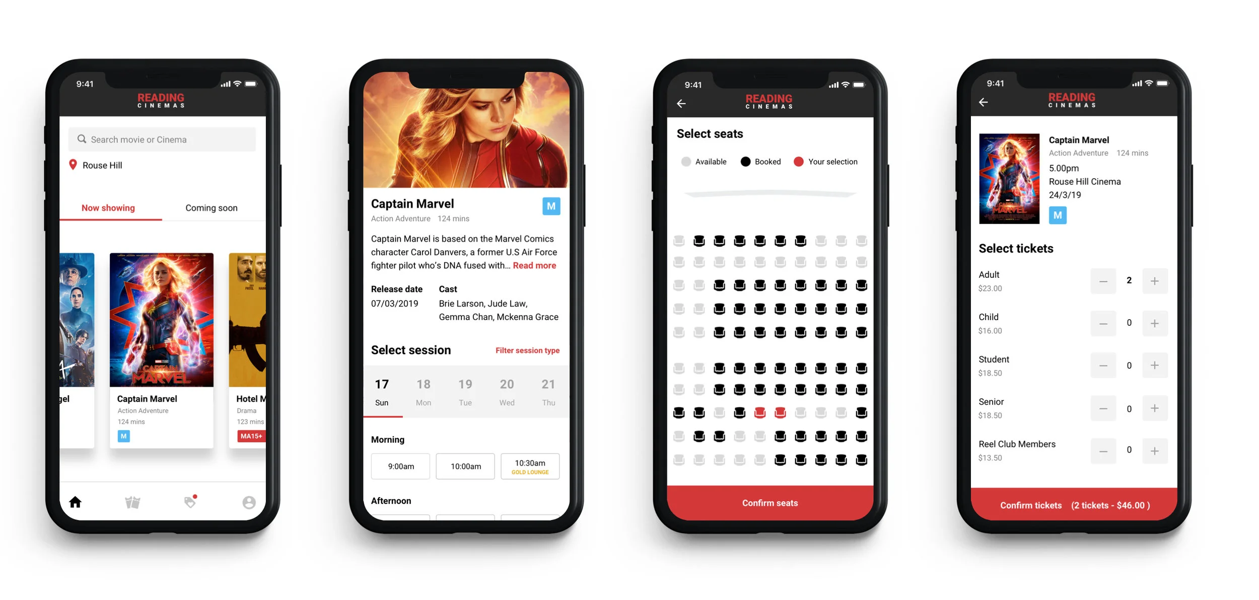
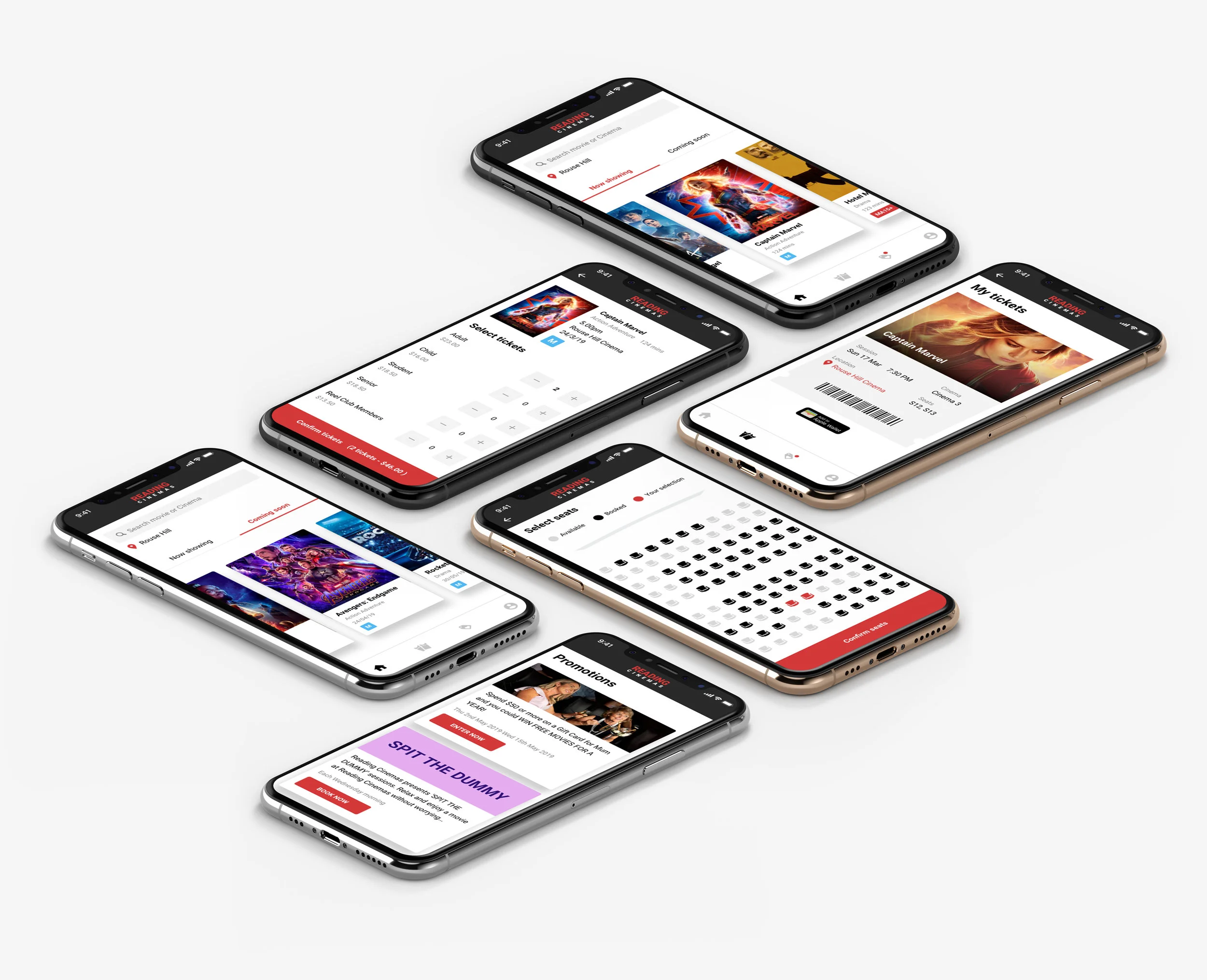
Final designs for the Home Screen, Session selection, Seats and Tickets.
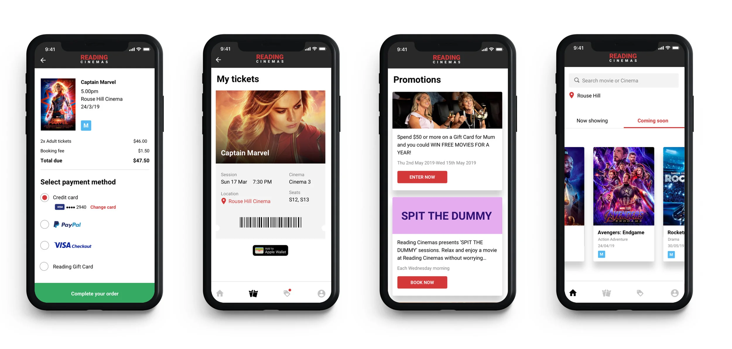
Final designs for the Payment, Mobile ticket, Promotions and Coming Soon movies.